Flora Mobile App Design/Case Study
Susanna Skaran
Flora is a floral delivery app designed to promote local businesses while keeping the process of ordering flowers as convenient as possible.
Background:
To make the process of floral delivery easier, I created Flora: an app designed so users can order flowers for delivery from a number of local florists, even if they are unfamiliar with the area. Note: This project is based on a fictional brand.
Tools used: Figma
Roles: UI Designer, UX Designer, UX Researcher
Duration: September-December 2023, 14 weeks (10-20 hours per week)
Competitive Audit:
I conducted a competitive audit between three main competitors: Bouqs, UrbanStems. and 1-800-Flowers. You can view the full audit here, but here are my main takeaways:
None of the competitors focus on connecting users with small/local businesses.
Prices between all competitors were fairly similar.
Only one competitor offered same-day delivery.
The sites with cleaner imagery were the easiest and most intuitive to navigate.
User Personas and Journey:
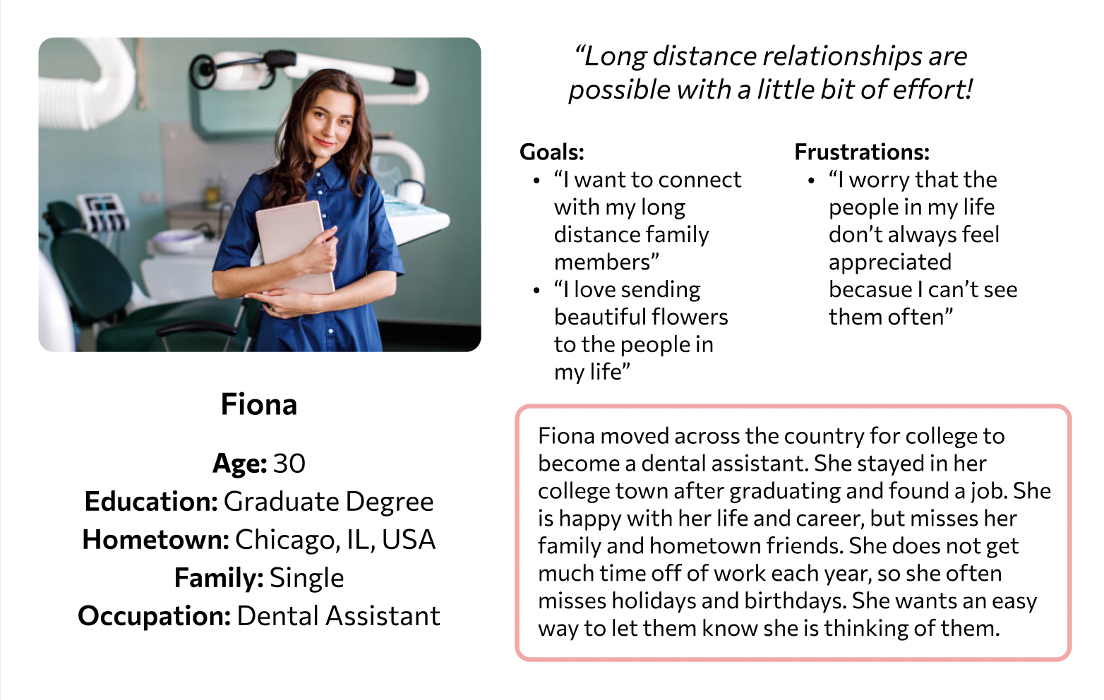
Meet Fiona!
Based on my research, Fiona is a great example of someone who would be likely to use the Flora app. This is one of the user personas I created.
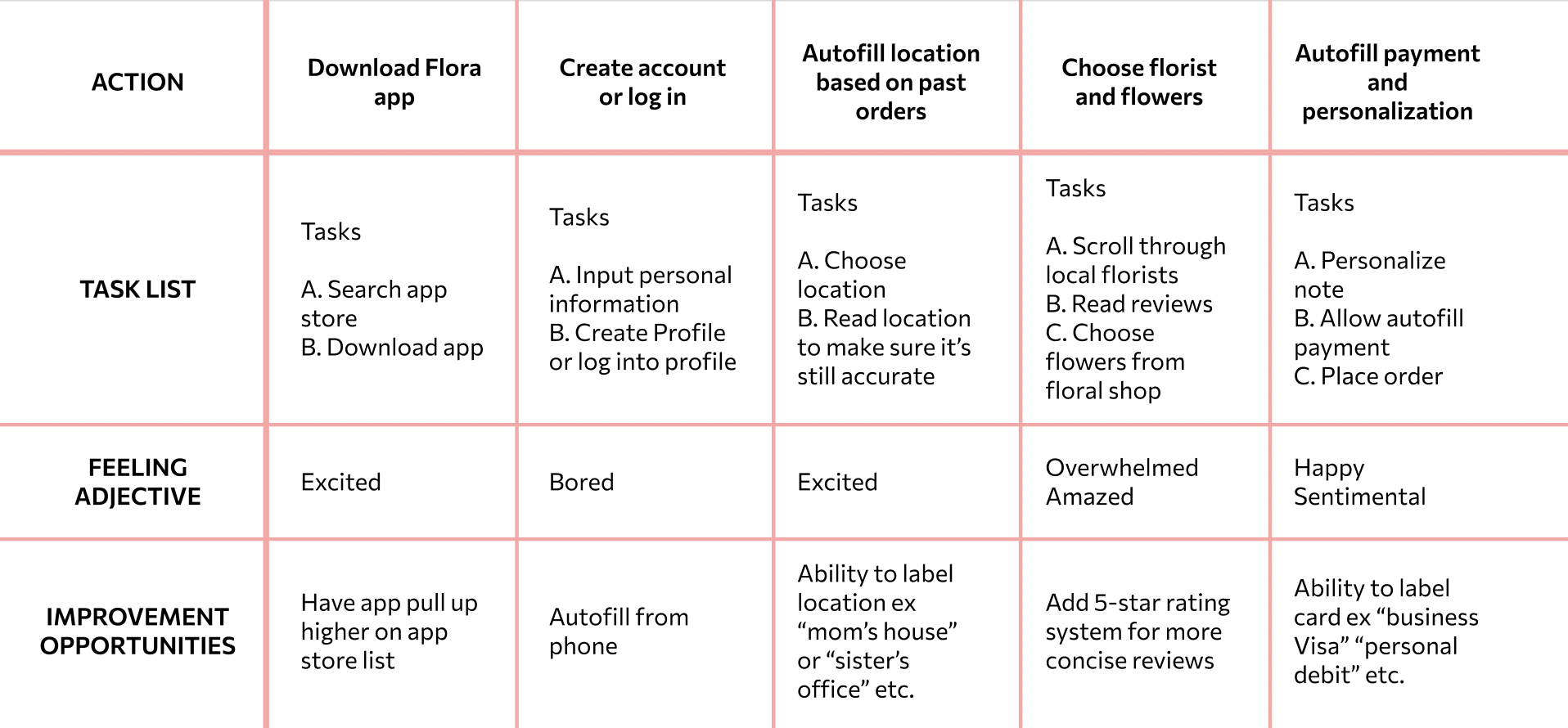
User Journey Map
Analysis of what Fiona’s journey using the Flora app might look like, along with some improvements to keep in mind for future updates.
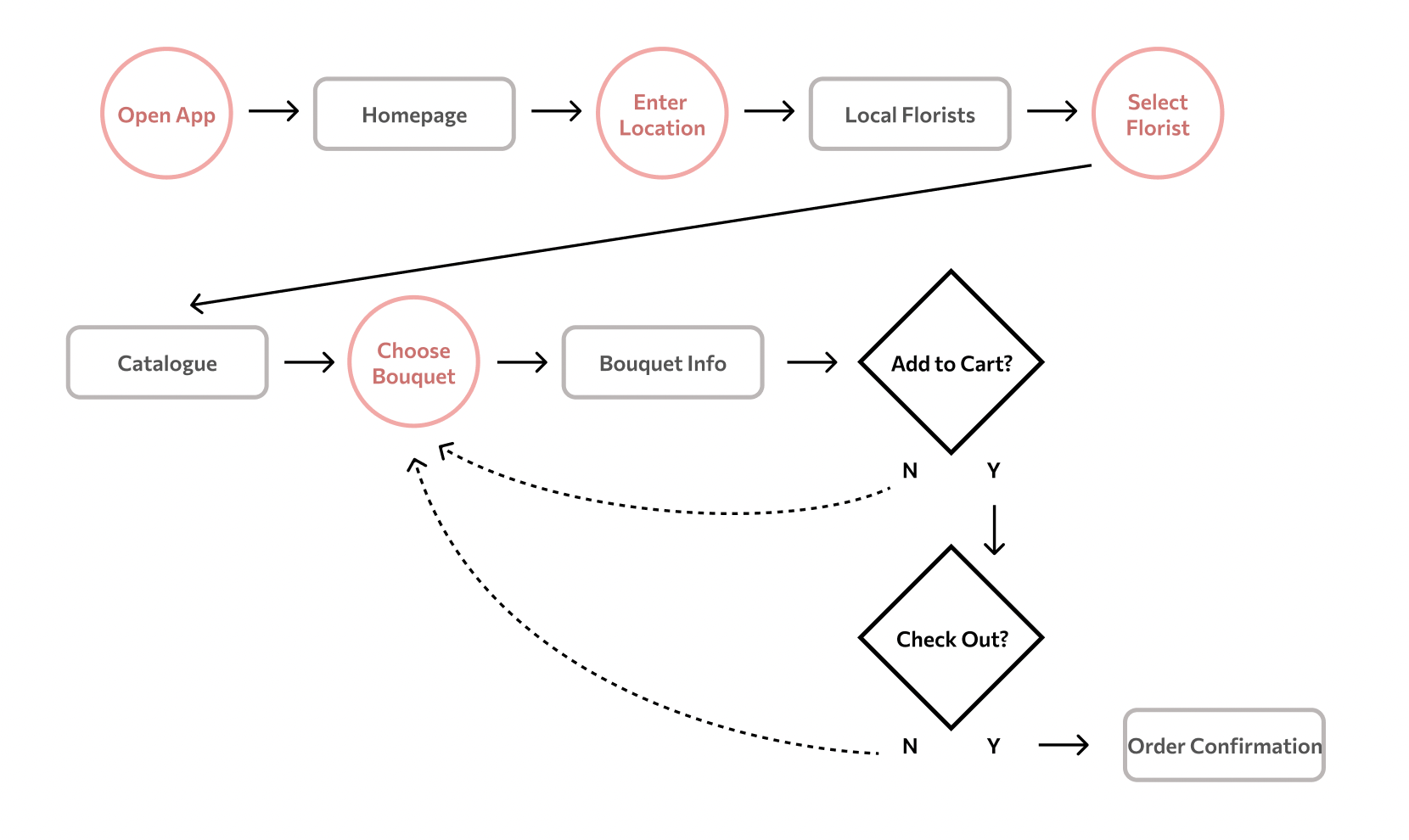
User Flow
Task: Use the Flora app to order flowers from a florist in your sister’s hometown for her birthday.
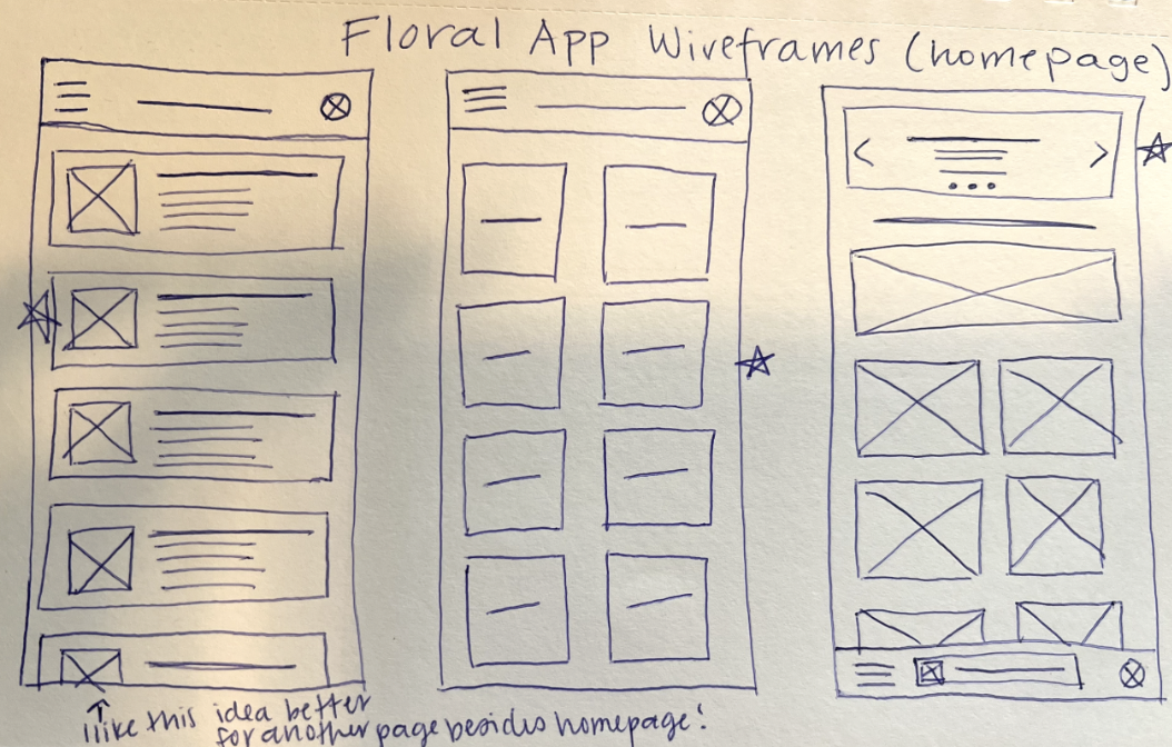
Wireframes:
Sketched wireframe sample:
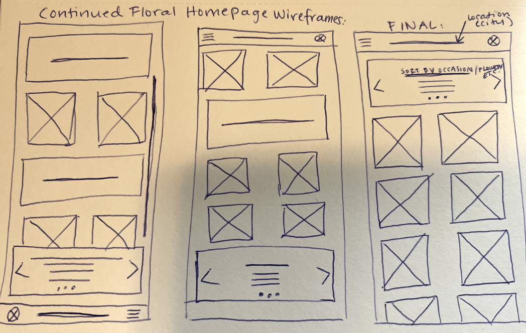
Digital Wireframe sample:
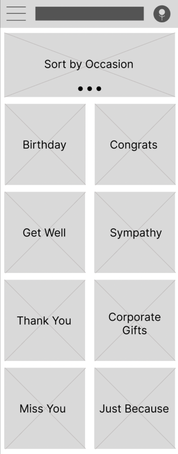
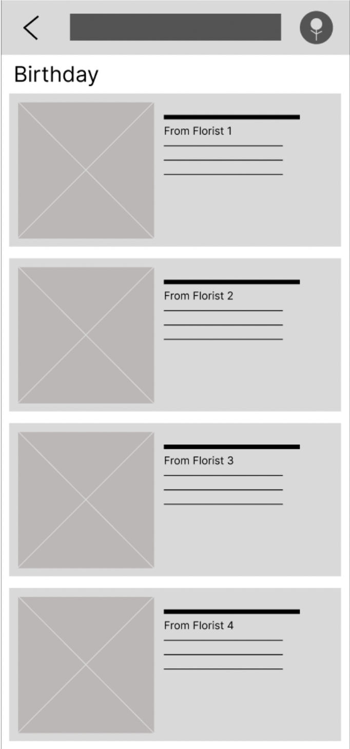
You can view my completed low-fidelity prototype here.
Usability Study:
Project Background: I am creating a Floral delivery app to encourage flower sales for small businesses. I noticed that when ordering flowers for loved ones living in different states, people tend to lean towards ordering from a larger scale national service rather than looking up small florists in an unknown area.
Study Details:
Research questions:
How long does it take for a user to select and order a bouquet in the app?
Are users able to successfully order the bouquet that they want?
What can we learn from the steps users took to order a bouquet?
Are there parts of the bouquet ordering process where users are getting stuck?
Is the payment process easy for the customers?
Participant qualifications: I chose 5 participants between the ages of 17 and 72 years old. There were two male, two female, and one nonbinary participant. Participants did not need to have experience ordering flowers online.
Methodology: Users were asked to participate in a 30 minute remote usability study where they were asked to order a bouquet of flowers using my low-fidelity prototype while talking through their process.
Findings and solutions:
Finding 1: Users prefer to have multiple sorting categories available (3/5 users attempted to sort by different categories).
Solution 1: Move forward with plans to sort by category.
Finding 2: Users thought the location changing feature should be easier to find (2 participants stated that they were unable to change the location, 2 different participants did not attempt to find the location changing feature).
Solution 2: Change icon for location changing feature.
Finding 3: Users would like to be able to sort by florist (3/5 users attempted to do this but it was not an option)
Solution 3: Add a sorting option to look at bouquets from one florist at a time.
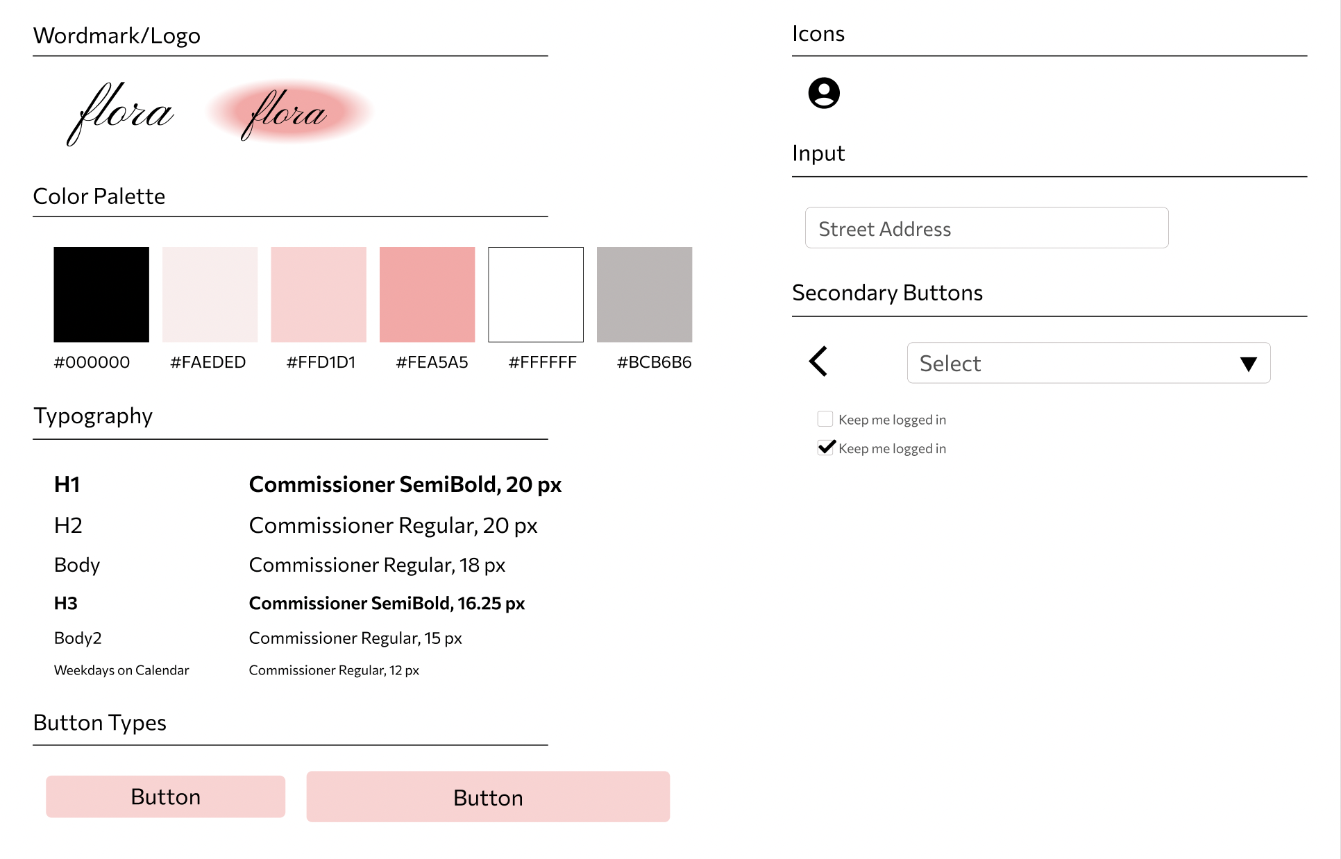
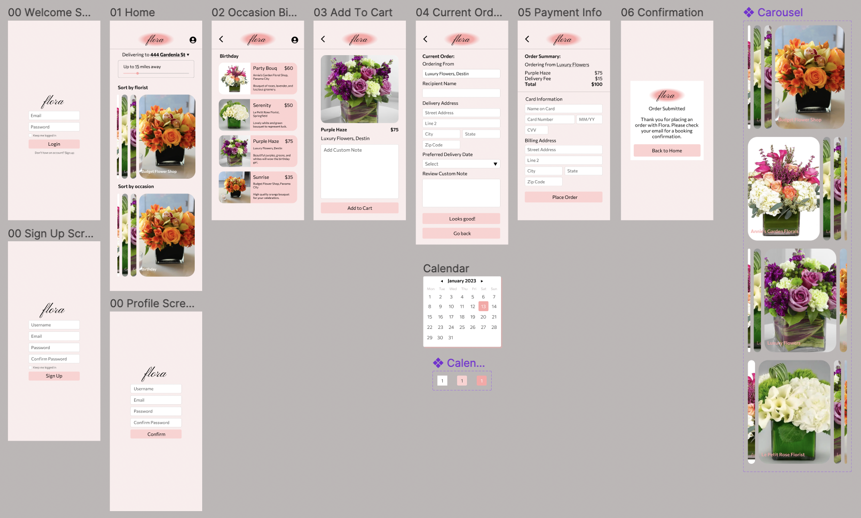
High Fidelity Prototype:
UI Kit/Sticker Sheet:
After developing my low fidelity wireframes and conducting my usability study, I created the following branding for Flora:
Reflection:
After completing my first project and case study, here are some things I’d do differently:
Increase accessibility by using higher contrast colors in my design.
Test my product across a larger group.
Add an option for the user to change the font and font color of their custom note.
Add an option for the user to review the florist and read other users’ reviews.